A Homepage With Endless Customization
A Homepage With Endless Customization
A Homepage With Endless Customization
The homepage is often the first thing visitors see when they land on your site. It sets the tone for their entire experience. A well-designed and engaging homepage can capture their attention and encourage them to explore further. Overall, the homepage plays a pivotal role in shaping the user experience, driving sales, and establishing a strong online presence for ecommerce platforms.
The homepage is often the first thing visitors see when they land on your site. It sets the tone for their entire experience. A well-designed and engaging homepage can capture their attention and encourage them to explore further. Overall, the homepage plays a pivotal role in shaping the user experience, driving sales, and establishing a strong online presence for ecommerce platforms.
The homepage is often the first thing visitors see when they land on your site. It sets the tone for their entire experience. A well-designed and engaging homepage can capture their attention and encourage them to explore further. Overall, the homepage plays a pivotal role in shaping the user experience, driving sales, and establishing a strong online presence for ecommerce platforms.
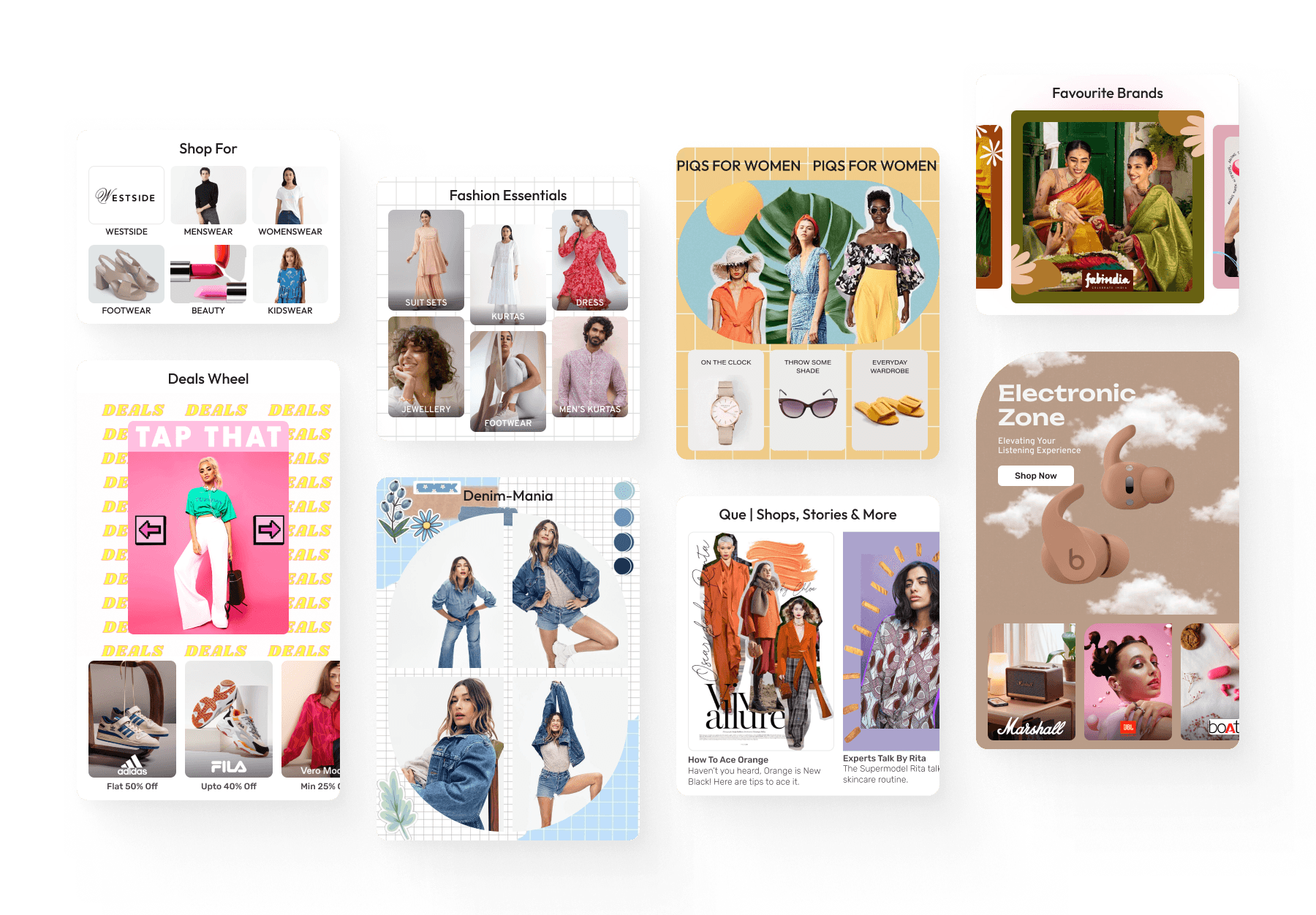


Problem Statement
The Homepage was typically handled by the creative and marketing teams. There was little to no intervention of the product design team.
As a result, there were no specialised components and guidelines for the homepage in place and the creative team had to use makeshift ways to achieve intended effects, which came with a great deal of compromises
There were a bunch of spacing, padding and scaling issues that arose on devices of different screen widths and aspect ratios which arose due to the non responsive way that the existing components were developed
Solution
Solution
Solution
The solution was to develop a set of versatile and modular components that would allow for complete customisation of the homepage and simultaneously solve for the problems mentioned above.
It would empower the creative team to seamlessly implement stellar designs and adopt completely fresh and unique looks for special occasions like sales and festival seasons the year without having to worry about the issues that plagued our homepage earlier.
What I did
What I did
What I did
Performed a thorough audit of our Homepage and merchendising pages on CLiQ to get an idea of the extent of issues and understand where things are going wrong
Benchmarked 25+ e-commerce apps and websites with the team to try and understand how they are pulling off creative layouts with their components
Created highly modular and scalable New Homepage Components with granular control and shared detailed dev and creative guidelines
Lead the design planning and component prioritisation and aligned on implementation logic with product and dev team. The aim was to handle the complexities at code level and keep the configuration end at smart edit as easy to use as possible
Created detailed dev and creative guidelines to ensure consistency and to set a visual design language
Meet The Components
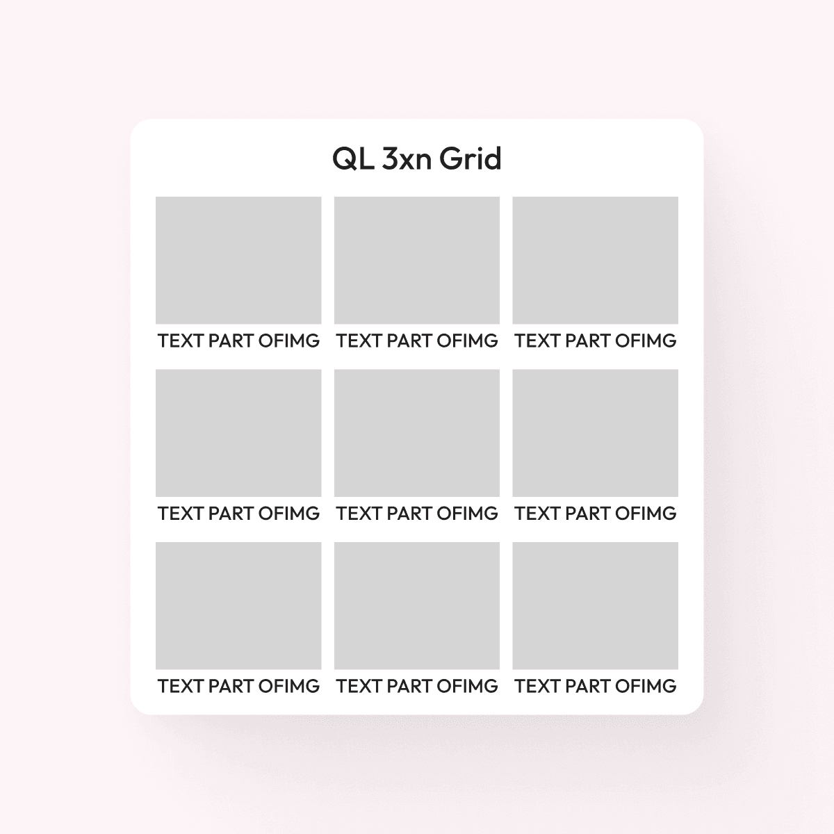
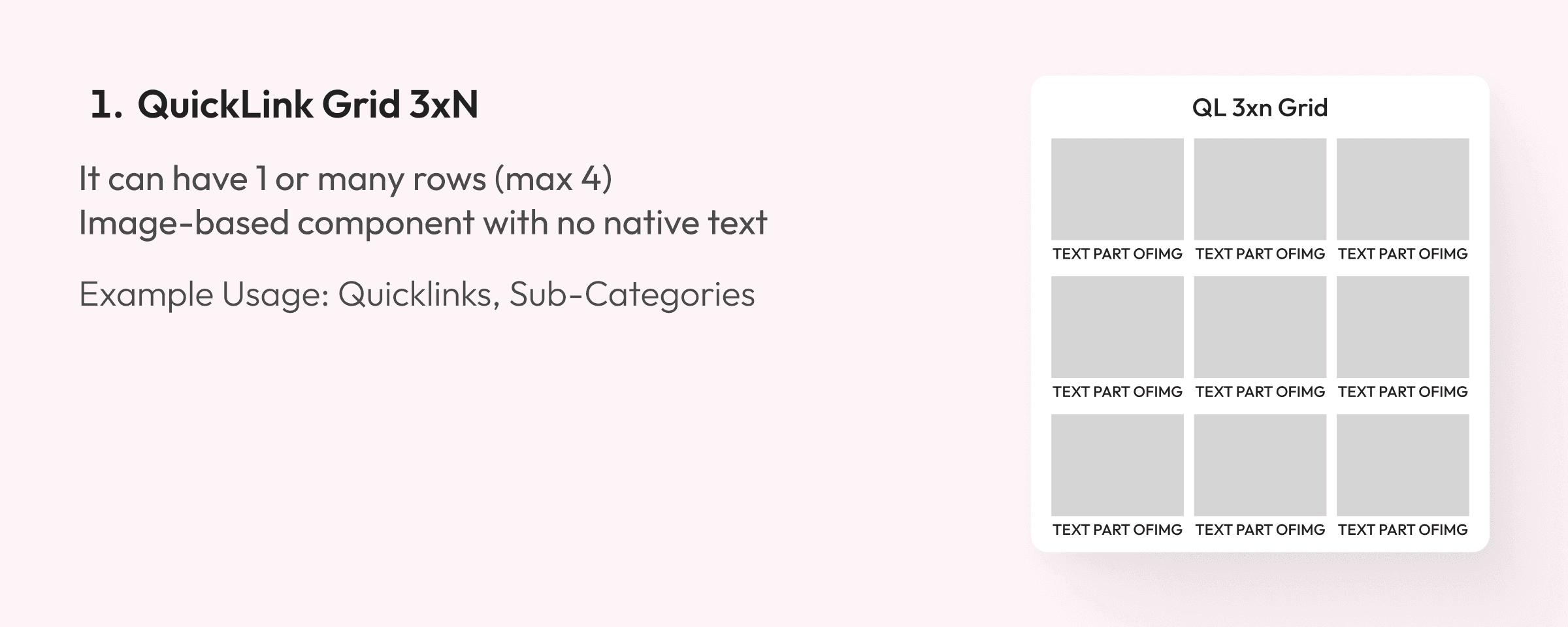
QuickLink Grid 3xN
It can have 1 or many rows (max 4)
Image-based component with no native text
Example Usage: Quicklinks, Sub-Categories

QuickLink Grid 3xN
It can have 1 or many rows (max 4)
Image-based component with no native text
Example Usage: Quicklinks, Sub-Categories
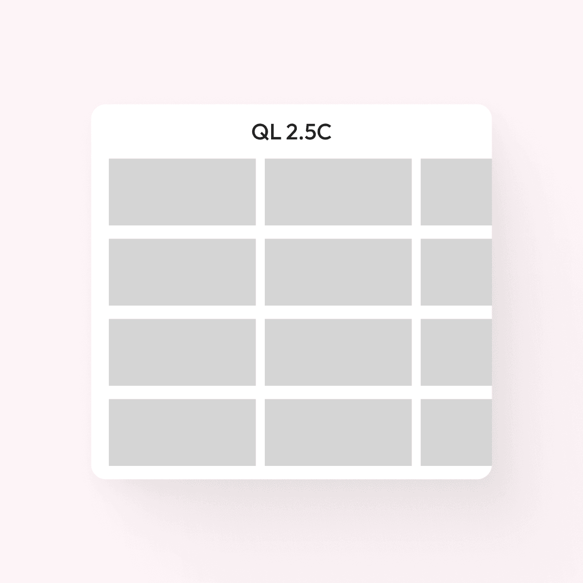
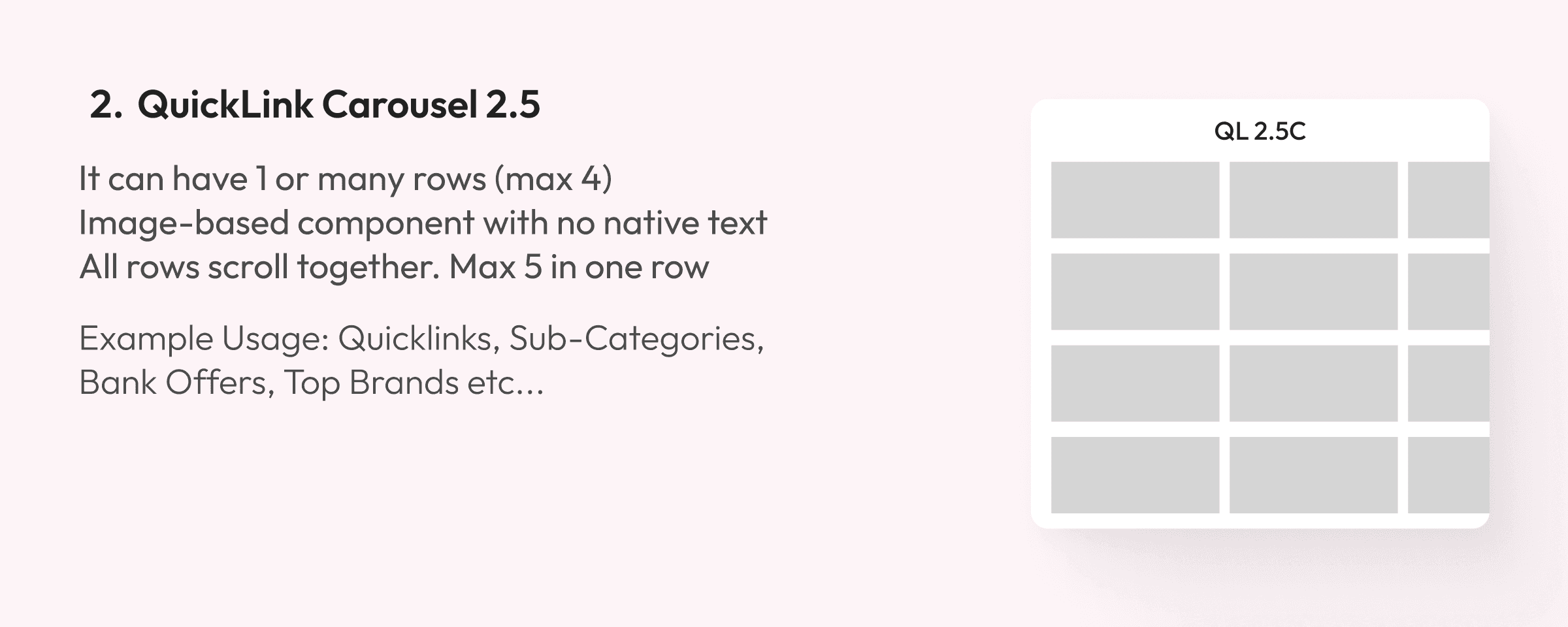
QuickLink Carousel 2.5
It can have 1 or many rows (max 4)
Image-based component with no native text
All rows scroll together. Max 5 in one row
Example Usage: Quicklinks, Sub-Categories

QuickLink Carousel 2.5
It can have 1 or many rows (max 4)
Image-based component with no native text
All rows scroll together. Max 5 in one row
Example Usage: Quicklinks, Sub-Categories
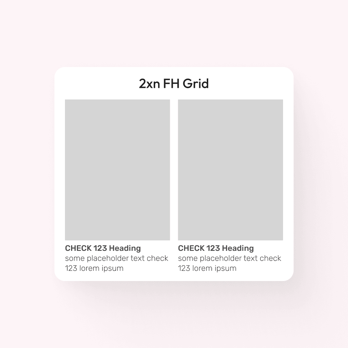
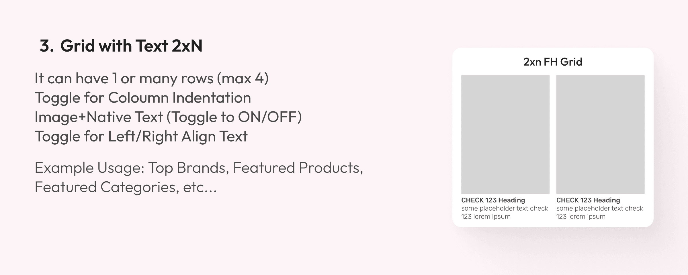
Grid with Text 2xN
It can have 1 or many rows (max 4)
Toggle for Coloumn Indentation
Image+Native Text (Toggle to ON/OFF)
Toggle for Left/Right Align Text
Example Usage: Top Brands, Featured Products, Featured Categories, etc...

Grid with Text 2xN
It can have 1 or many rows (max 4)
Toggle for Coloumn Indentation
Image+Native Text (Toggle to ON/OFF)
Toggle for Left/Right Align Text
Example Usage: Top Brands, Featured Products, Featured Categories, etc...
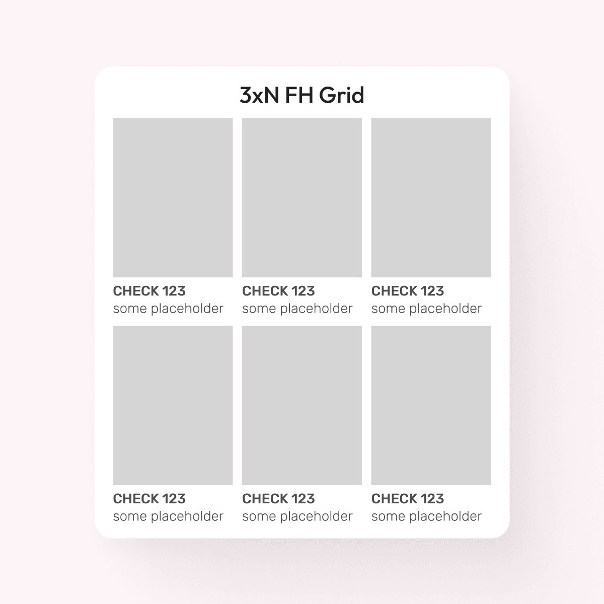
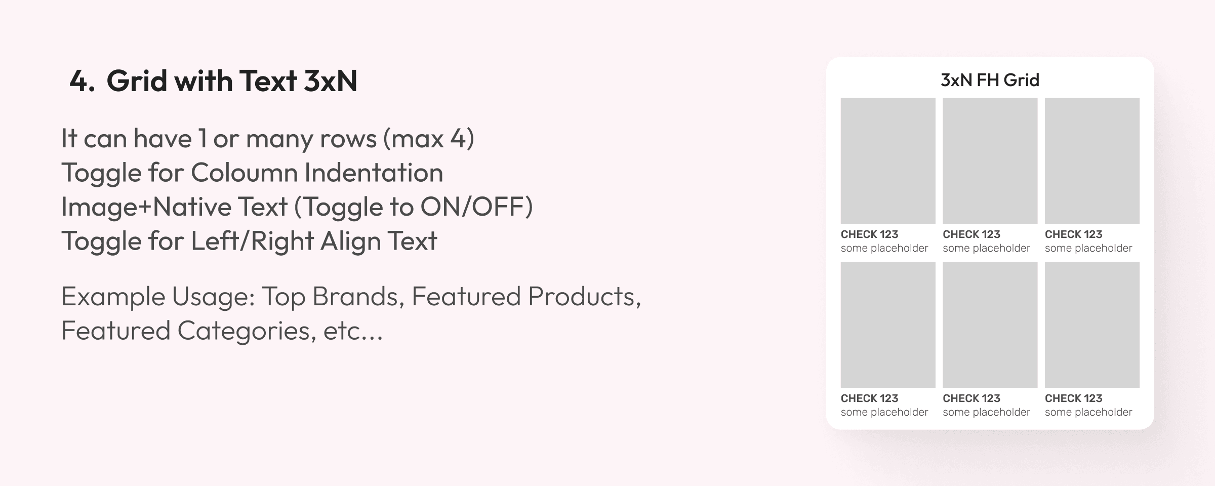
Grid with Text 3xN
It can have 1 or many rows (max 4)
Toggle for Column Indentation
Image + Native Text (Toggle to ON/OFF)
Toggle for Left/Right Align Text
Example Usage: Top Brands, Featured Products, Featured Categories, etc...

Grid with Text 3xN
It can have 1 or many rows (max 4)
Toggle for Column Indentation
Image + Native Text (Toggle to ON/OFF)
Toggle for Left/Right Align Text
Example Usage: Top Brands, Featured Products, Featured Categories, etc...
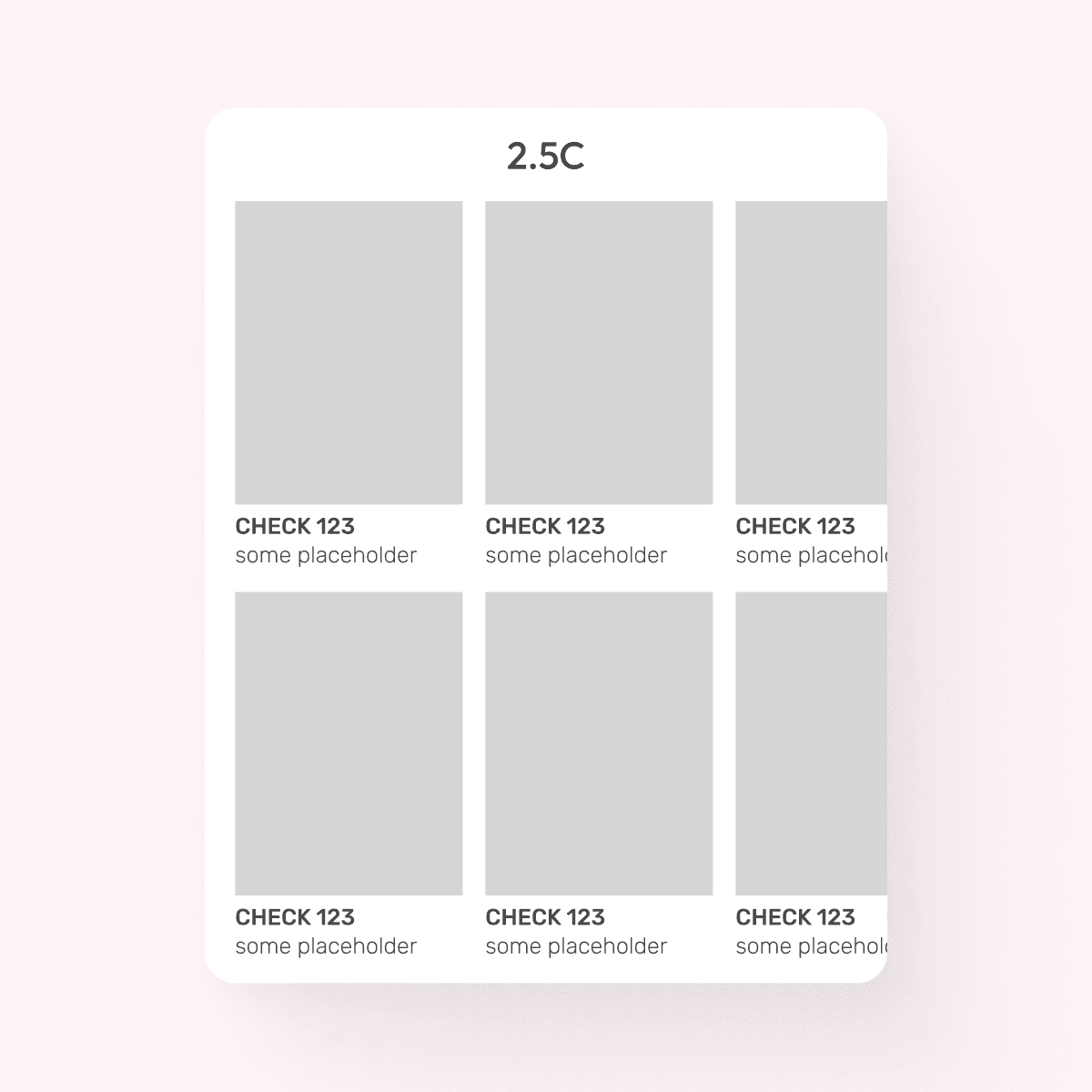
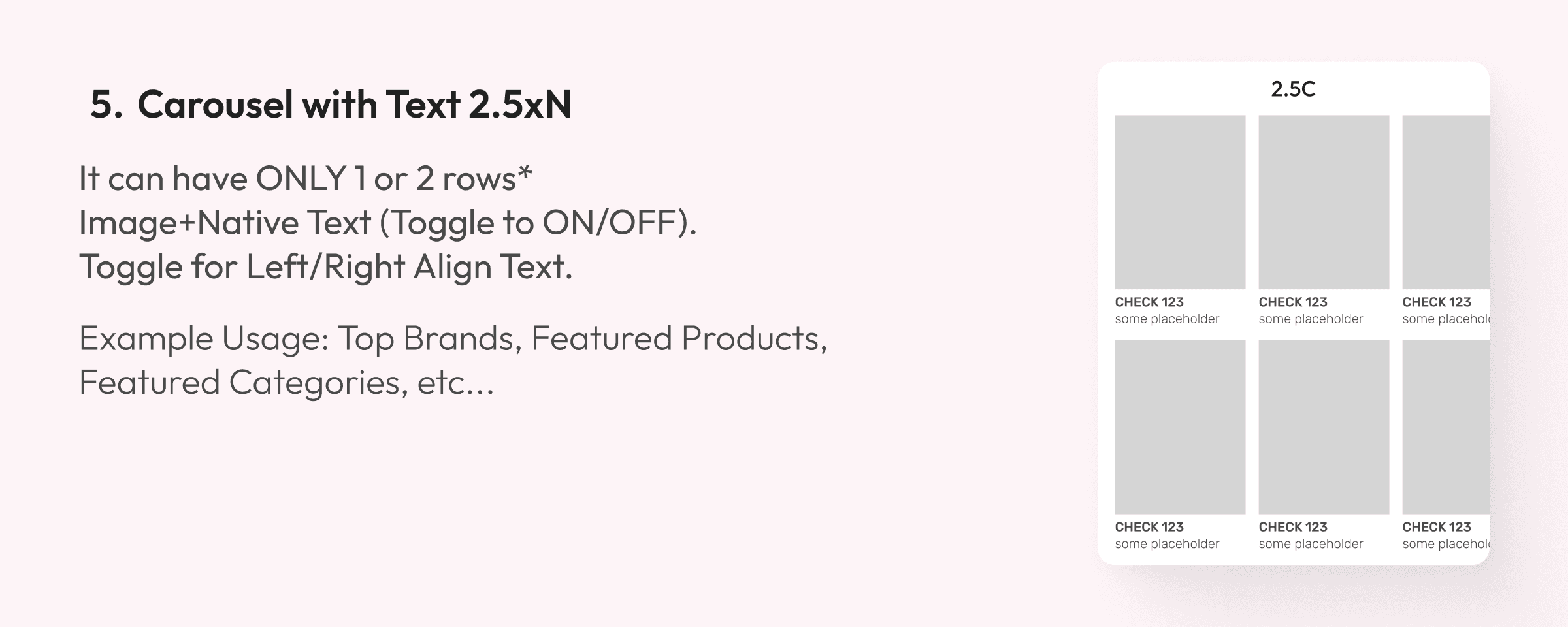
Carousel with Text 2.5xN
It can have ONLY 1 or 2 rows*
Image+Native Text (Toggle to ON/OFF).
Toggle for Left/Right Align Text.
Example Usage: Top Brands, Featured Products, Featured Categories, etc...

Carousel with Text 2.5xN
It can have ONLY 1 or 2 rows*
Image+Native Text (Toggle to ON/OFF).
Toggle for Left/Right Align Text.
Example Usage: Top Brands, Featured Products, Featured Categories, etc...
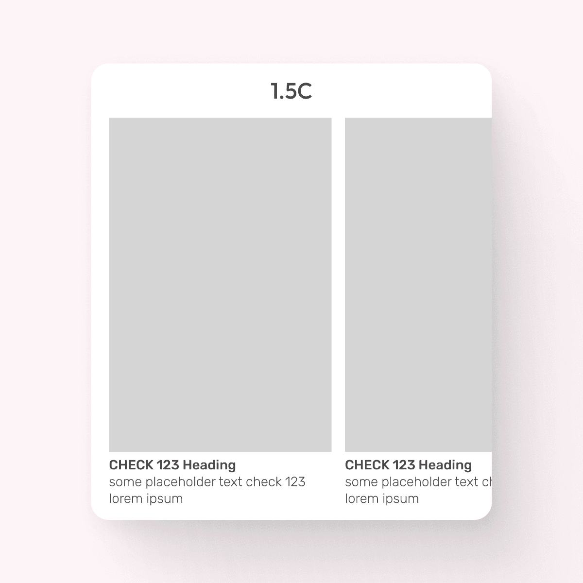
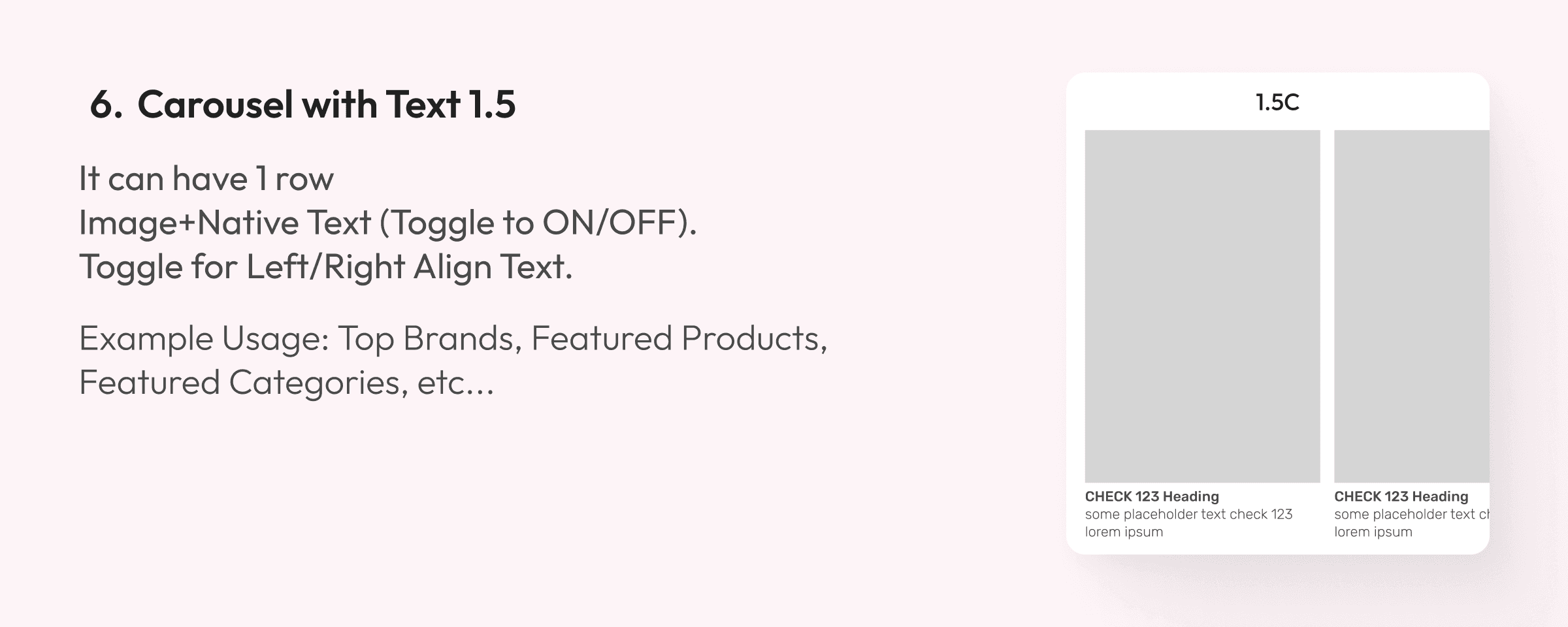
Carousel with Text 1.5
It can have 1 row
Image + Native Text (Toggle to ON/OFF).
Toggle for Left/Right Align Text.
Example Usage: Top Brands, Featured Products, Featured Categories, etc...

Carousel with Text 1.5
It can have 1 row
Image + Native Text (Toggle to ON/OFF).
Toggle for Left/Right Align Text.
Example Usage: Top Brands, Featured Products, Featured Categories, etc...

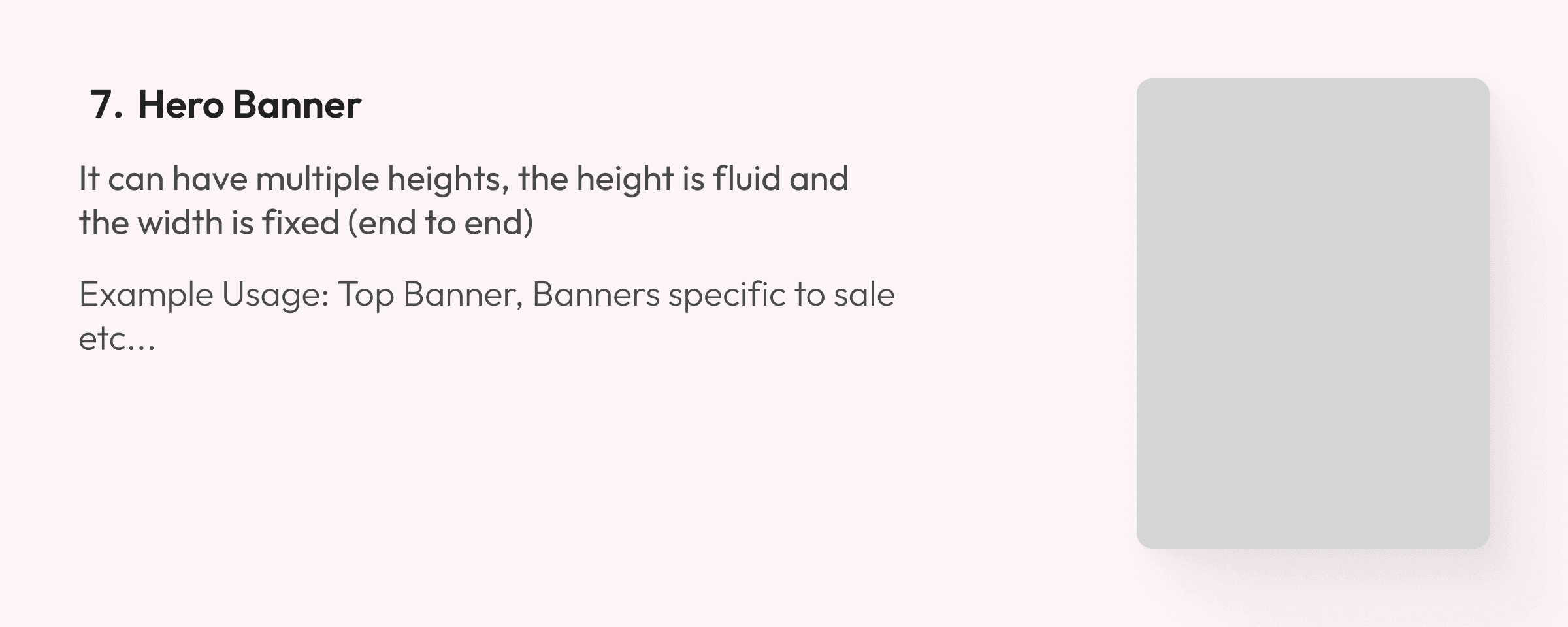
Hero Banner
It can have multiple heights, the height is fluid and the width is fixed (end to end)
Example Usage: Top Banner, Banners specific to sale etc...

Hero Banner
It can have multiple heights, the height is fluid and the width is fixed (end to end)
Example Usage: Top Banner, Banners specific to sale etc...
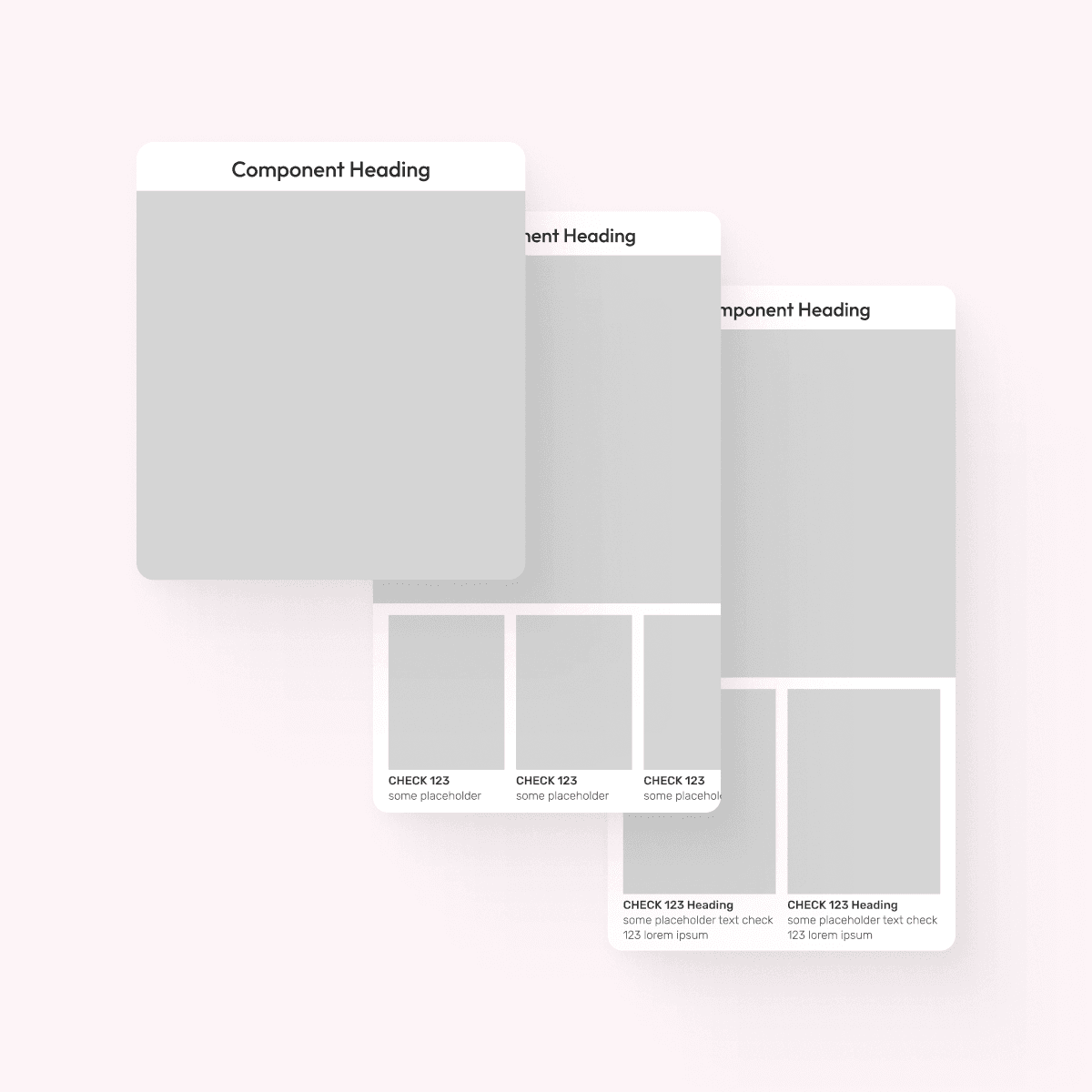
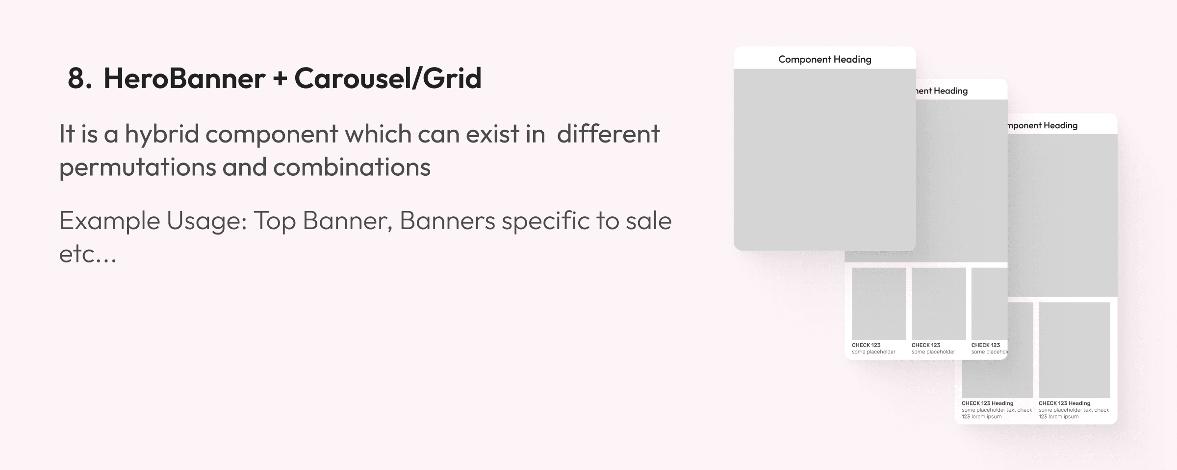
HeroBanner + Carousel/Grid
It is a hybrid component which can exist in different permutations and combinations
Example Usage: Top Banner, Banners specific to sale etc...

HeroBanner + Carousel/Grid
It is a hybrid component which can exist in different permutations and combinations
Example Usage: Top Banner, Banners specific to sale etc...
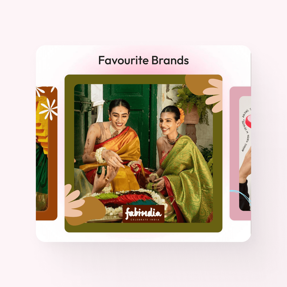
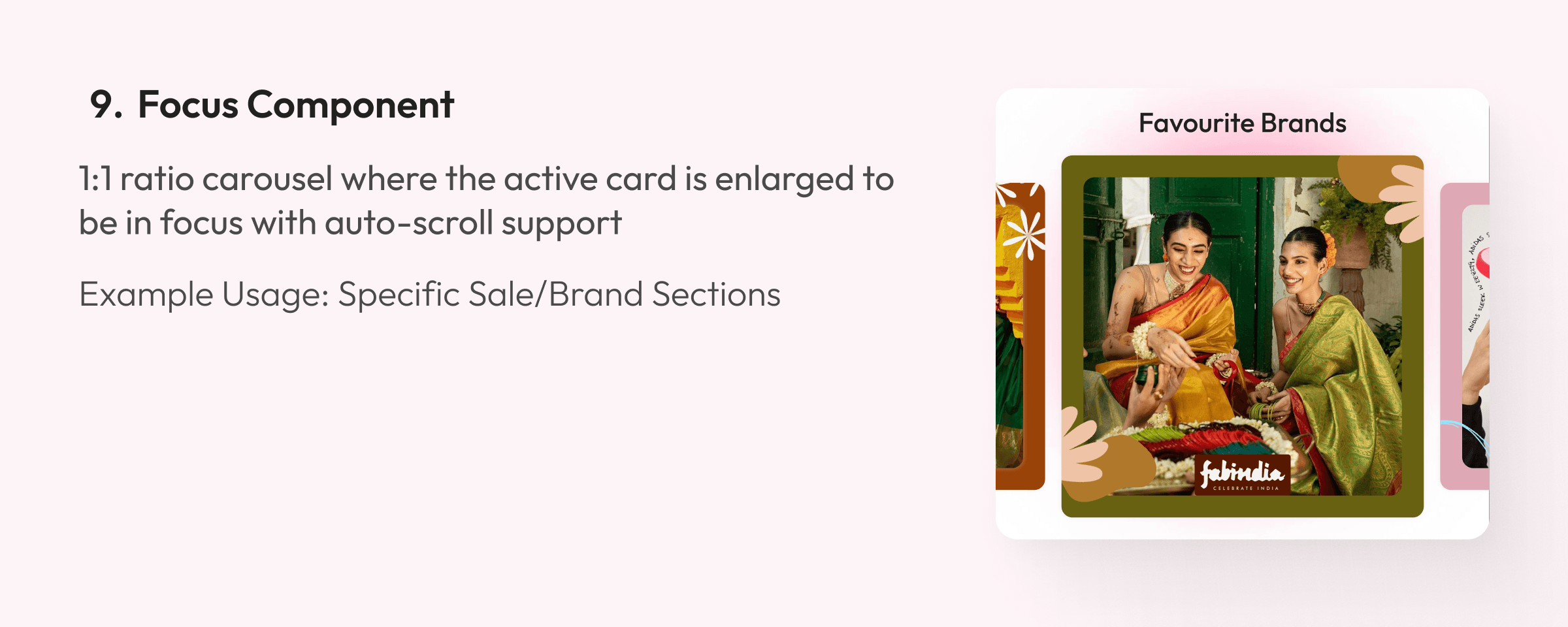
Focus Component
1:1 ratio carousel where the active card is enlarged to be in focus with auto-scroll support
Example Usage: Specific Sale/Brand Sections

Focus Component
1:1 ratio carousel where the active card is enlarged to be in focus with auto-scroll support
Example Usage: Specific Sale/Brand Sections
Meet The Components
Meet The Components









Component Properties
Component Properties
Component Properties
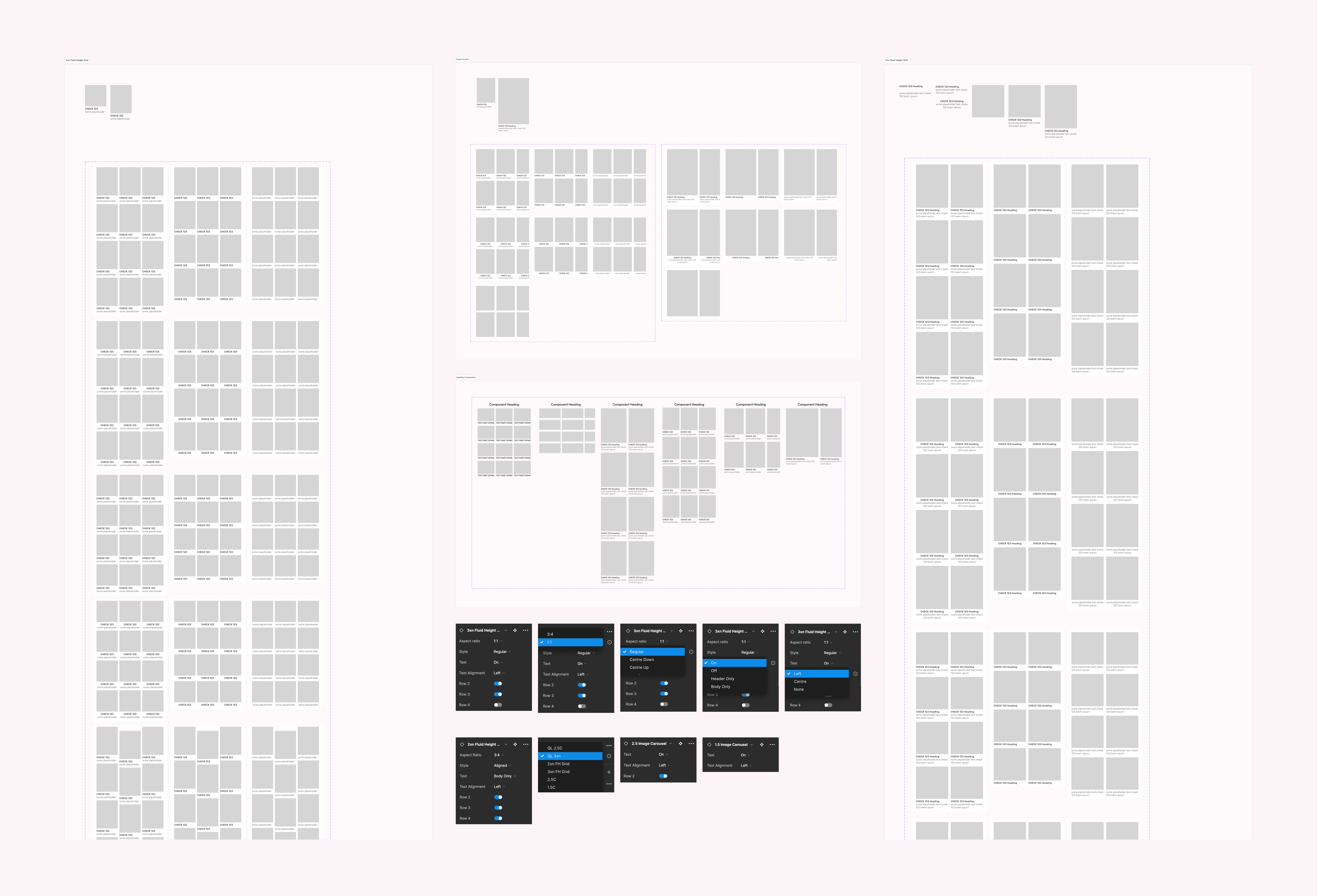


The components were designed to be highly scalable and versatile in nature
All spacing and padding between elements were intrinsically defined in the components
These elements were designed with custom image and GIF support at both the image containers and overall component level
The components were designed to be highly scalable and versatile in nature
All spacing and padding between elements were intrinsically defined in the components
These elements were designed with custom image and GIF support at both the image containers and overall component level
The components were designed to be highly scalable and versatile in nature
All spacing and padding between elements were intrinsically defined in the components
These elements were designed with custom image and GIF support at both the image containers and overall component level
Outcome and Impact
Outcome and Impact
Outcome and Impact
Created over 10 Specialised components and developed creative and dev guidelines to ensure we ship perfect designs on Homepage
Resolved spacing, padding, and scaling issues for responsive design
We saw a 15% increase in homepage engagement across mobile devices post shipping these new components
Created over 10 Specialised components and developed creative and dev guidelines to ensure we ship perfect designs on Homepage
Resolved spacing, padding, and scaling issues for responsive design
We saw a 15% increase in homepage engagement across mobile devices post shipping these new components
Created over 10 Specialised components and developed creative and dev guidelines to ensure we ship perfect designs on Homepage
Resolved spacing, padding, and scaling issues for responsive design
We saw a 15% increase in homepage engagement across mobile devices post shipping these new components